Making Color Work

22 August 2015
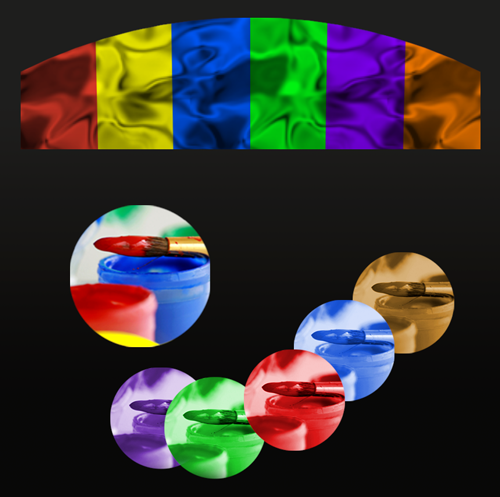
Color Color Color Color Color
I'm often asked about color - or more to the point, people want to know how to make color decisions for websites and brand palettes.
It's a jungle out there.
Good News
More Good News and Two Easy Color Rules
- Selecting color is a visual problem, and it begs a visual solution.
- We perceive color in relationship to other colors. For the best professional results, designers use palettes of a limited selection of colors grouped for a particular effect or purpose.
Happily, there are some excellent online tools to help you see color and create your own palette. Here are a few good tools to get you started.
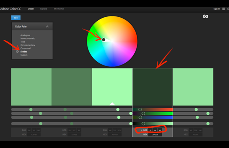
An interactive color wheel gives you instant combinations based on a color you select.
I selected a dark de-saturated green, in Shades color rule. (The closer the selected color is to the center, the less color, or saturation, it has.)
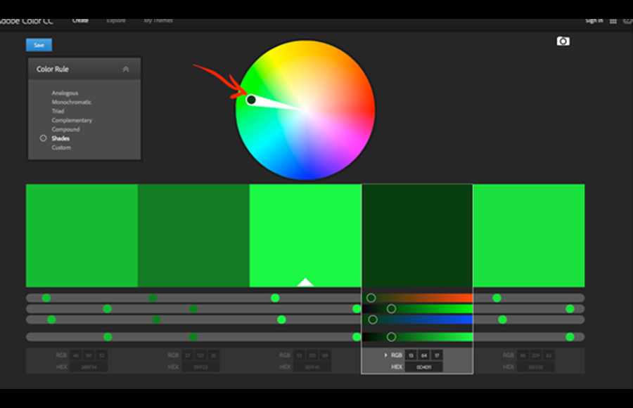
Here, the same Shades color rule displays a more saturated green combination.
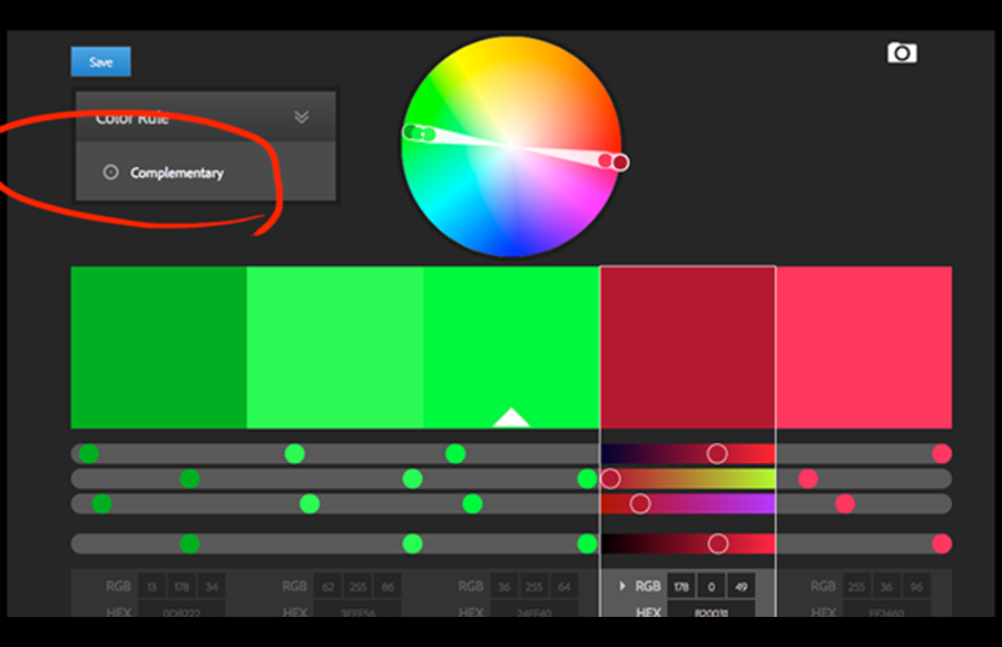
Selecting the Complementary color rule, the picker gives you the exact complement (opposite) of the green on the color wheel, which is a dark red. Now the tool creates a whole new spread of colors.
A different type of interactive color wheel lets you spin out color combinations quickly.

Compare the colors you selected to an accurate reference source like Pantone color books.
See how someone else combined colors, for inspiration.

Canva is a fun and useful "everything-you-need-to-know-about-color" design wiki. You can search for a descriptive color name or select a color square right from the page.

Go to an information page that's all about the single color you selected.

Find interesting combinations preassembled!
You'll find inspirational tools on Canva too, and a palette generator that will kick out color combos from your uploaded photo.